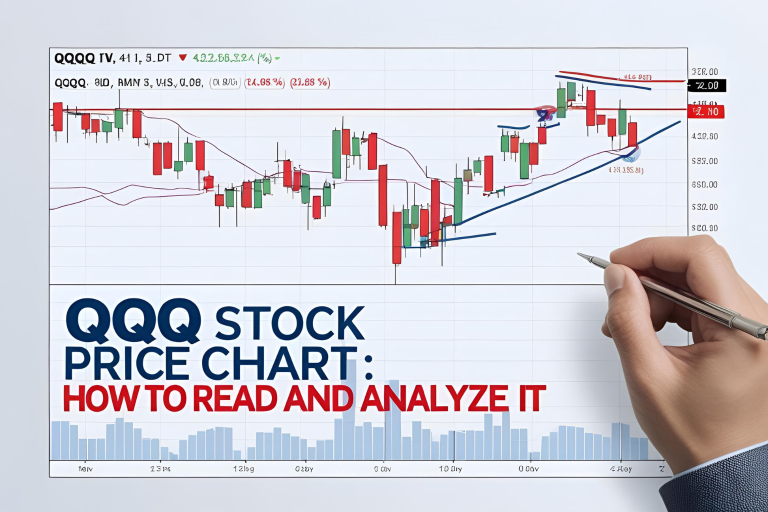
QQQ Stock Price Chart: How to Read and Analyze It
Introduction
The QQQ stock price chart is more than just a line graph—it’s a powerful tool that helps investors and traders make informed decisions. Whether you’re evaluating entry points, identifying trends, or analyzing historical performance, understanding how to read and interpret this chart is essential. In this guide, we’ll walk you through the basics and beyond.
Where to Find the QQQ Stock Chart
You can view the live QQQ chart on platforms like:
- TradingView
- Yahoo Finance
- Google Finance
- Brokerage platforms (e.g., TD Ameritrade, Fidelity, Robinhood)
These charts offer various timeframes, technical indicators, and drawing tools.
Types of QQQ Charts
- Line Chart
Shows the closing price over time. Good for beginners. - Candlestick Chart
Displays opening, closing, high, and low prices for a given period. Best for technical analysis. - Bar Chart
Similar to candlesticks but with a different visual layout.
Key Chart Timeframes
- 1 Day: For intraday traders
- 1 Week – 1 Month: For short-term swing traders
- 6 Months – 1 Year: Medium-term view
- 5 Years – Max: Long-term investors
Each timeframe provides different insights based on your investment goals.
Important Technical Indicators
Here are some popular indicators you can apply to the QQQ chart:
- Moving Averages (50-day, 200-day) – Help identify trends
- Relative Strength Index (RSI) – Measures overbought/oversold conditions
- MACD (Moving Average Convergence Divergence) – Detects trend reversals
- Volume – Confirms price movement strength
These tools help filter out noise and validate potential buy/sell signals.
Common Chart Patterns
Look for these visual patterns in the QQQ chart:
- Uptrend/Downtrend Channels
- Double Top / Double Bottom
- Head and Shoulders
- Support & Resistance Levels
Recognizing patterns can help you forecast future price action.
Example: How to Read a Basic QQQ Setup
Let’s say QQQ is trading above its 50-day and 200-day moving averages, and RSI is near 60:
- This suggests bullish momentum.
- If volume increases with price, the breakout is considered stronger.
- If RSI crosses 70, it could signal a potential overbought condition.
Always combine multiple indicators for confirmation.
Risk of Over-Reliance on Charts
Charts are helpful but not foolproof. They don’t account for:
- Market news or earnings announcements
- Macroeconomic factors
- Geopolitical events
Use technical analysis as a complement to fundamental research.
Final Thoughts
Understanding the QQQ stock price chart gives you a major edge, whether you’re timing the market or just trying to spot trends. By combining chart types, indicators, and patterns, you can make smarter, data-driven decisions.
FAQs
Where can I see a live QQQ stock price chart?
Trading platforms like TradingView, Yahoo Finance, and most brokers offer it.
Which chart is best for QQQ analysis?
Candlestick charts provide the most depth for technical analysis.
Is QQQ good for technical trading?
Yes, QQQ has high liquidity and strong trend behavior, making it suitable for chart-based trading.
Can I use RSI and MACD on QQQ charts?
Absolutely. These are common indicators used for analyzing momentum and trends.
What’s the best timeframe for QQQ charts?
It depends on your strategy—long-term investors may use 1Y+, while traders may use hourly or daily charts.